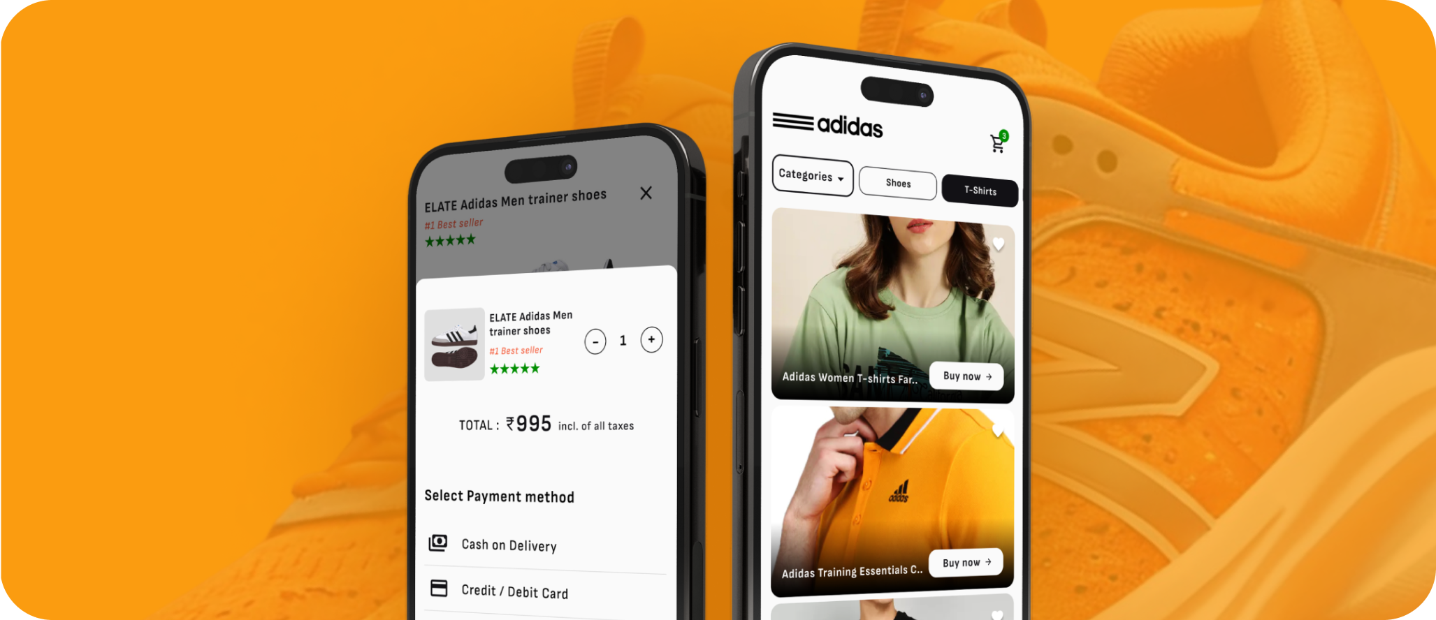
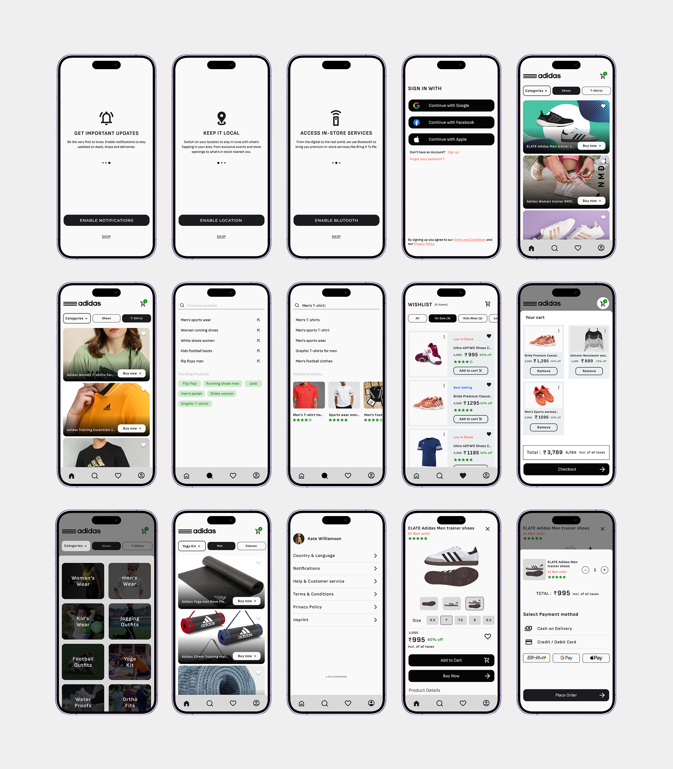
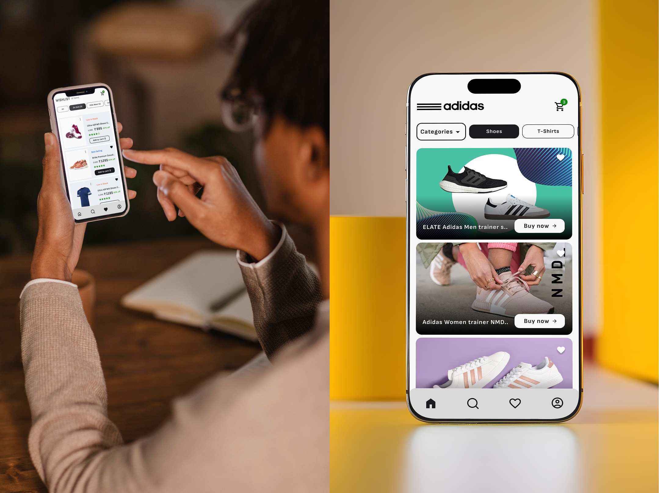
ADIDAS

ROLE / SERVICES
UI UX Design
PROJECT TYPE
Dashboard UI
LOCATION & YEAR
Bangalore, 2023

The Adidas app redesign is about making your app faster and easier to use, so you can do more of what you love. With a fresh new look and feel, the built-in mobile search functionality has been enhanced with added visual cues and you can now browse for product names, categories and styles without leaving the home screen.

Challenges

The challenge of a mobile app redesign is to create a visual language and layout that consumers can easily understand. The experience we want to create has to match the functionality of our application, but it also needs to be highly engaging, and provide the best possible user experiences.

Quantitative Research

To ensure a data-driven approach to improving the Adidas app's user experience, we conducted a quantitative research analysis based on user feedback from the Google Play Store. By analyzing over 30 reviews, we identified critical pain points that impact the app's usability, functionality, and overall user satisfaction.

Figuring out the issues

The current onboarding screens present usability challenges, including poor skip button placement and lack of clear, visible information. Users may struggle to navigate or understand key features, impacting their initial experience. Enhancing readability, accessibility, and intuitive navigation can significantly improve engagement and ease of use.

Mid Fidelity Wireframes

Structured layout showcasing Adidas app’s user flow, navigation, and interactions.

End Product

The redesigned screens focus on improving usability, clarity, and overall user experience. By addressing key pain points from the existing Adidas mobile app, the new design enhances navigation, optimizes button placement, and refines information hierarchy. The goal is to create a more seamless, intuitive, and visually appealing interface that ensures users can interact with the app effortlessly.

Outcome & Impact

Improved Decision-Making:

Refined UI elements and optimized layouts create a visually engaging and user-friendly shopping experience.

Better Accessibility:

Clearer typography, optimized button placements, and enhanced readability ensure smoother interactions for all users.

Faster Decision-Making:

Simplified filters and well-structured product listings allow users to make purchasing decisions more efficiently.

Since you’ve made it this far, I’m guessing something caught your eye! While webpages can’t talk, I can, so let’s chat about designs, experiences, and ideas. Feel free to book a time that works for you through my Calendly link.

Find Me Online

Insta
Property 1=Default (2)Property 1=Variant2 (2)